SCOTTRADE
For this project I led a 10 person team from concept to launch in the redesign of Scottrade's Online Apply. This product allows users to open new Scottrade accounts: the "bread and butter" of Scottrade's business.
OVERVIEW
Sector Financial- stock brokerage firm.
My Roles UX Design Team Manager, Senior UX Designer, Product Designer, Client Relationship Main Point of contact for UX related needs.
Business Challenge Scottrade’s rate of new trading accounts opened online was below optimal. Trading accounts are the “bread and butter” of their business. Therefore, Scottrade targeted a business goal of 30% increase in new accounts opened post redesign.
Design Challenge Design an impeccable product that would hit and ideally surpass the main business goal while presenting users with sleek modern design for a process (opening a new account) that required users to answer more than 150 questions.
Result Scottrade was very happy with our designs and overall process. Scottrade reported an increase of 63% in online accounts opened since launch of the new Online Apply (OLA) product.
Viewpoints Desktop, tablet, phone. Responsive.
PROCESS BREAKDOWN
Pre-workshop Analytics
I communicated with the client before we started the redesign process to collect as much information as possible about their problem and needs, and to analyze available data. I also received some redesign ideas and data re: their target audiences, which I studied to prepare for my workshops. Various Scottrade teams had different ideas about how to solve their problem; they had all worked hard, but in silos. I needed to bring the whole Scottrade team together to work in a collaborative manner.
Results of my Design Studio Workshop, which I created and implemented for this project and others at Isobar.
Business Goals and Mission/Vision Workshop
The first workshop I held was the Business workshop, where I re-confirmed business goals. The client expressed their pain points in detail, as well as their “blue sky” for the product.
Needs Gathering Workshop
I conducted four Design Thinking workshops to collect needs from all interested parties and stakeholders. I collected 320 requirements, which we organized in nine categories. I used most of the category names created by workshop participants. Then, I analyzed and prioritized the results of this workshop as preparation for the following step: Co-Design Studio.
Learning One big lesson I’ve learned during my career is to not only carefully listen and empathize with my clients, but to utilize the ideas and language they provide during workshops as much as possible. This always helps me to create a stronger and more collaborative and happy relationship with my clients.
Next, I held workshops to start feature design.
Co-Design Studio
Co-Design Studio is a Design Thinking technique for UX design I pioneered. My team and I used it to collectively (with workshop attendees) design new features and layouts for Scottrade. I led all Co-Design Studio workshops.
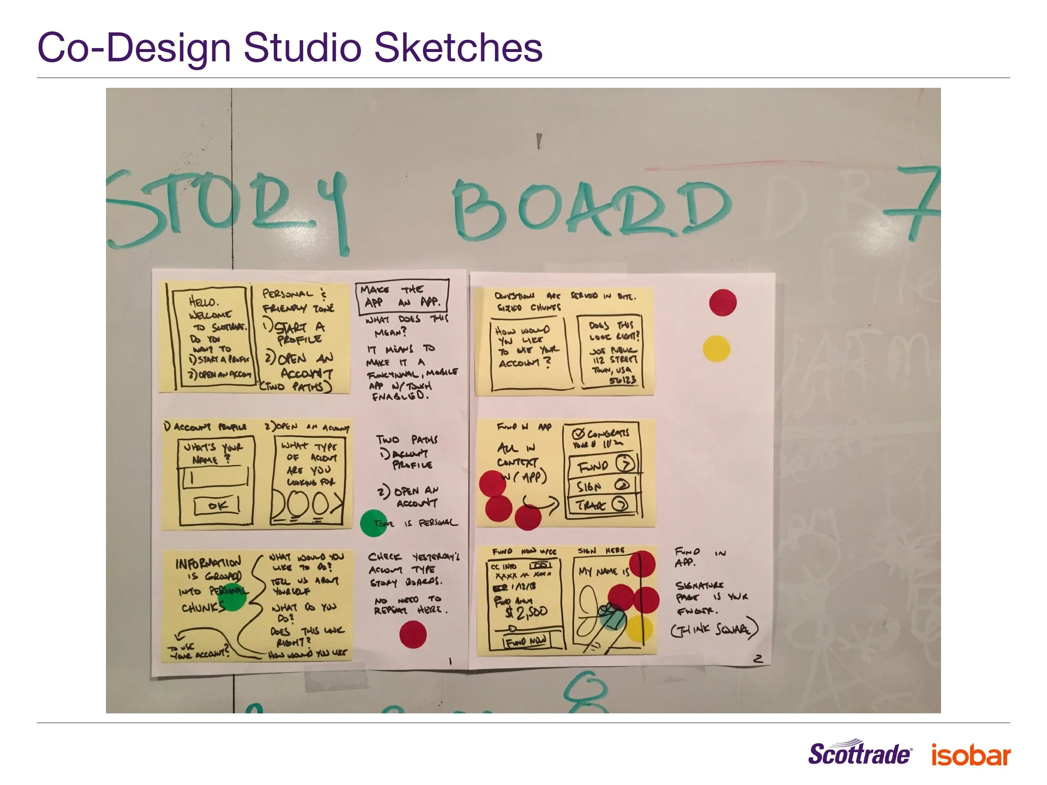
The image below showcases a Story Board that workshop attendees created during our Co-Design Studio. The color dots represent “votes”. That is, the features workshop attendees voted for as the top features to include in the final design.
My team and I utilized the results of Co-Design Studio (Story Boards with prioritized features) to inform our UX design in the following steps of the process.
Learning Co-design Studio step #5 Group Sketch is not absolutely necessary for the process. Sometimes, everyone is tired by the time we get to that step. So, it can be scratched.
Prioritized Features Story Board. Sample result of the Co-design Studio Workshop.
Needs Prioritization
My team and I categorized all needs into logical buckets to facilitate the creation of User Stories. We shared that information via Google sheets with the tech team. After analysis and prioritization, I obtained consensus from the client on the requirements to tackle first, which my team and I translated into 265 User Stories for the development process.
Example User Story: As a new customer, I want to be able to start the process of applying for an account in such a way that it could be saved initially and completed at a later time.
UX Design
I took all the results from my workshops at the client site, and worked on our internal UX design in a collaborative manner with my team. The UX team was composed of one junior and two senior designers. I was one of the senior designers.
Define Design Principles
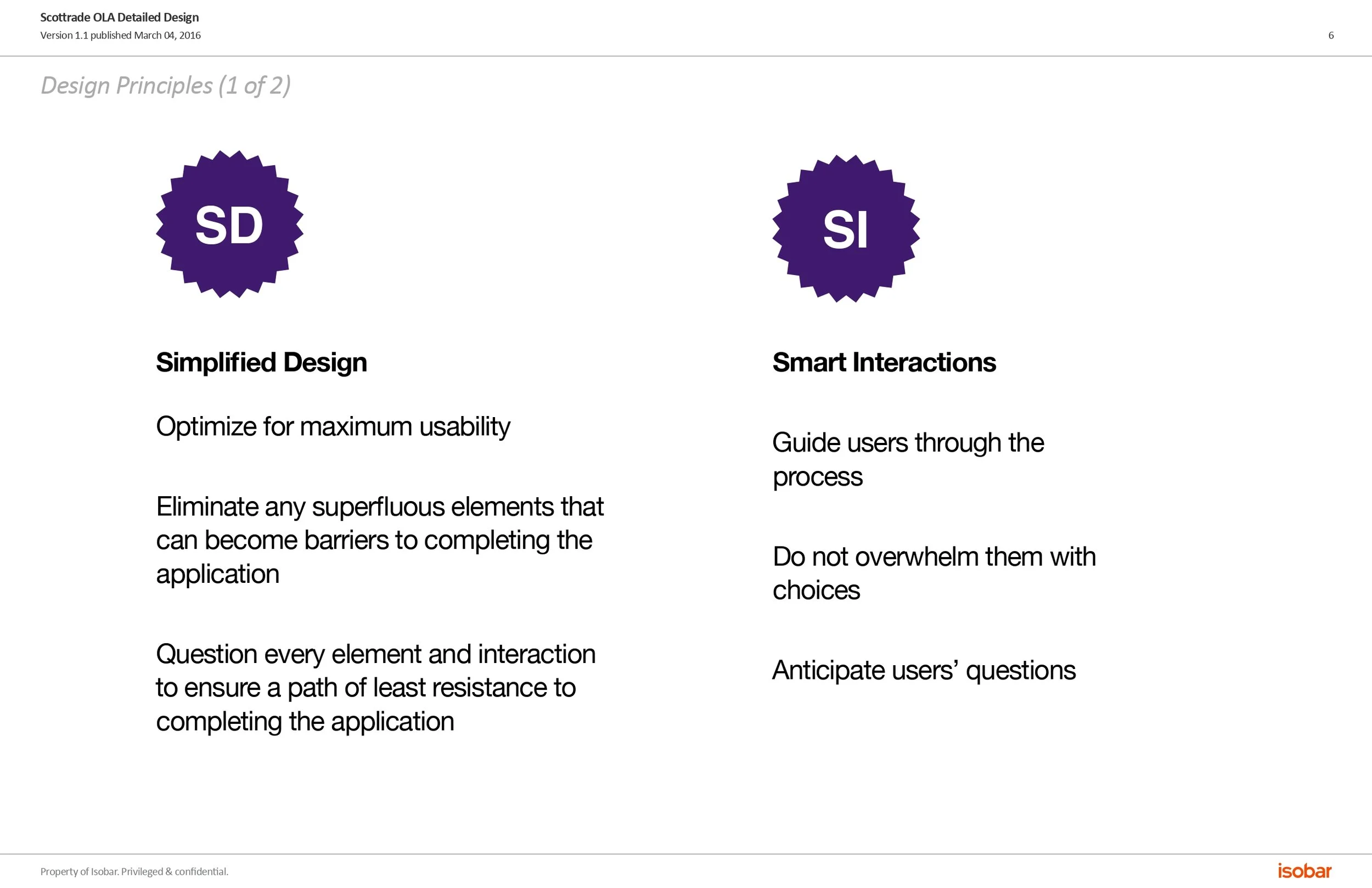
We defined our design principles based on our collective UX knowledge, the user data we received from Scottrade and the data we collected during workshops.
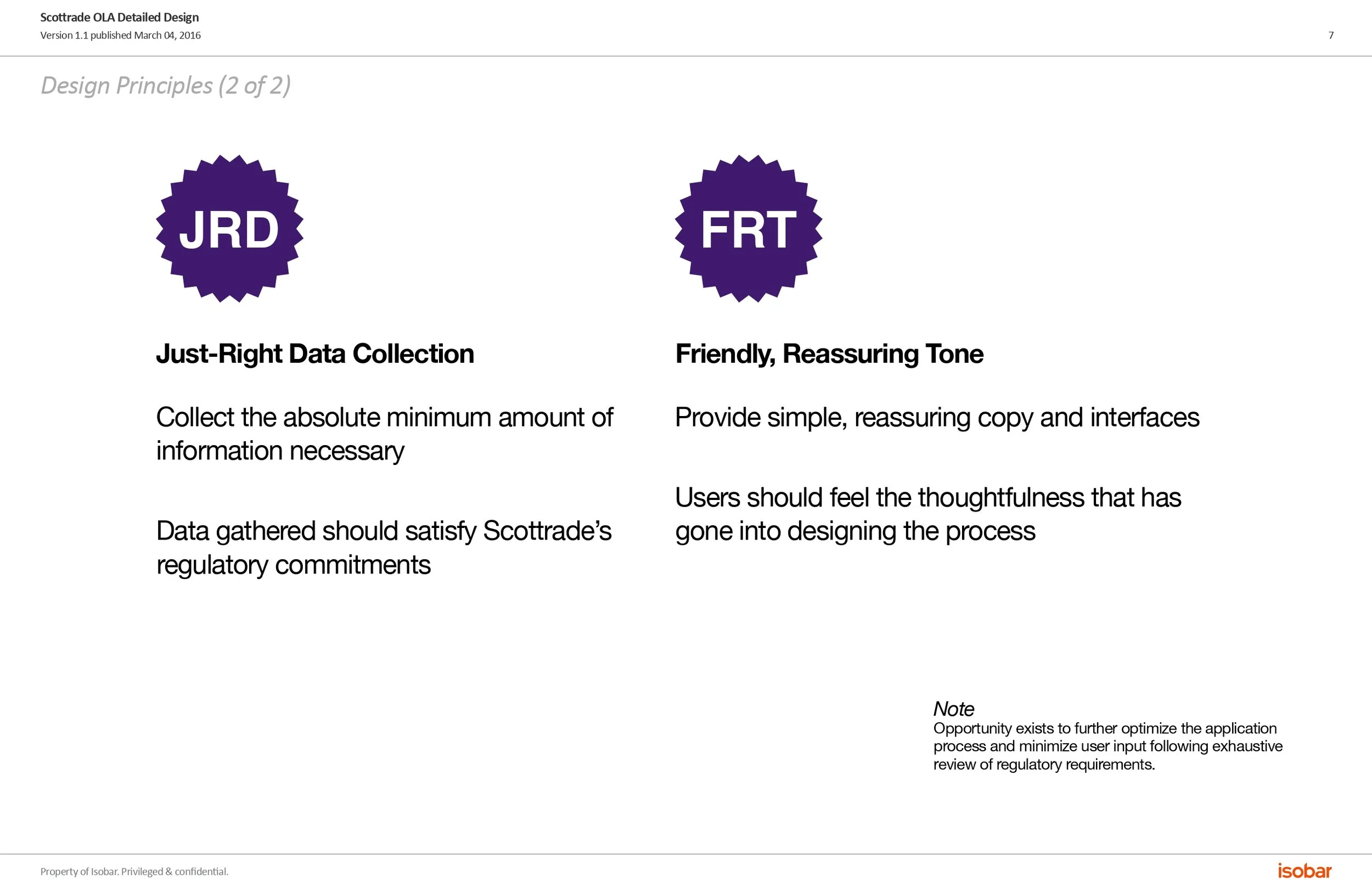
Four design principles were established: Simplified Design, Smart Interactions, Just-Right Data Collection and Friendly, Reassuring Tone.
Design Principles 2
Conduct Usability Testing
We also conducted in person Usability Testing to confirm if Progressive Disclosure was right for this product.
I introduced Usability Testing at this point in the process to make sure our idea of using Progressive Disclosure was the best design solution.
This product requires users to answer more than 150 questions before opening an account. Therefore, we needed to make the process less cumbersome for end users.
The results of Usability Testing confirmed our initial incline to design with Progressive Disclosure for account opening.
Lead Internal UX Sessions
At the same time we were conducting Usability Testing to confirm if our innovative ideas were the right design decision, I held a few internal sessions where all three UX designers (I was one of them) discussed how to best approach each component.
Once in agreement about the best way to proceed, we each designed our assigned components. Since I also acted as the UX Manager in the project, I assigned workload and components to our three UX designers.
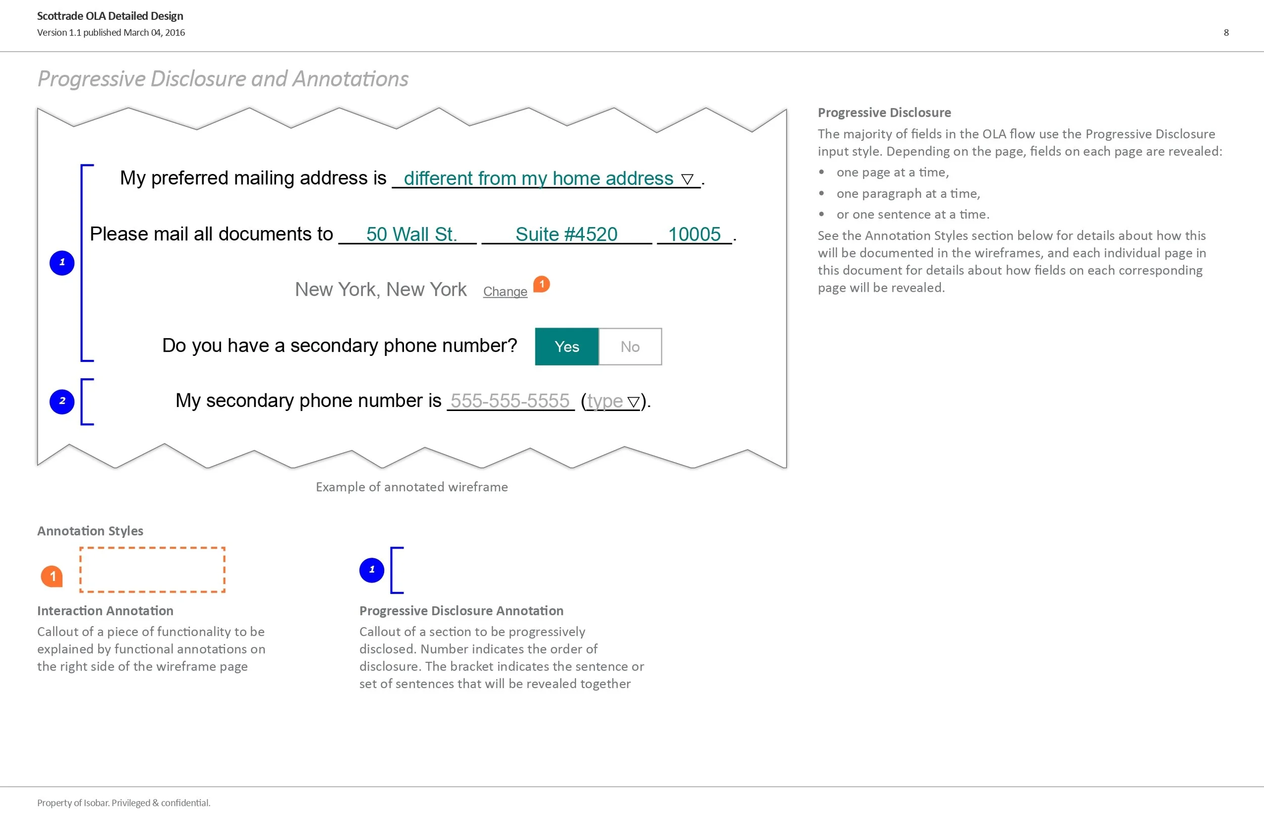
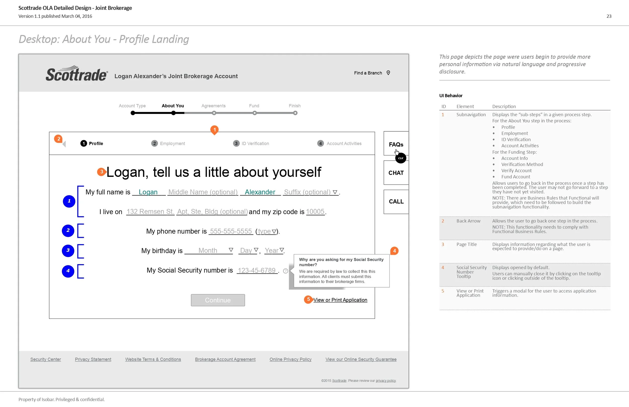
Define Progressive Disclosure Wireframe Design Pattern
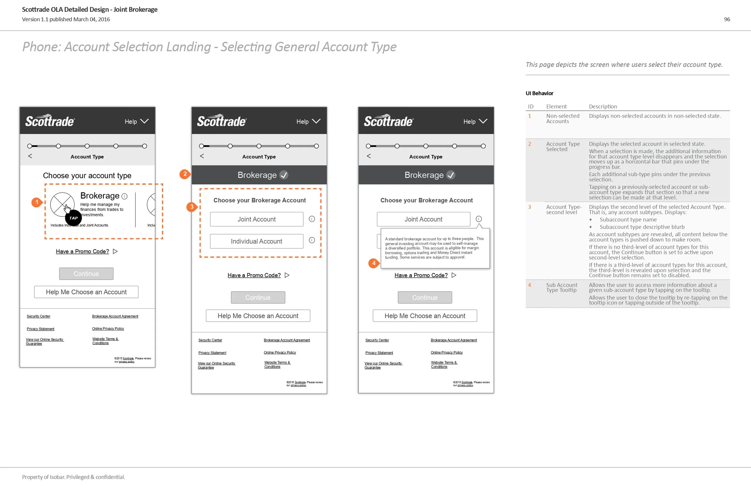
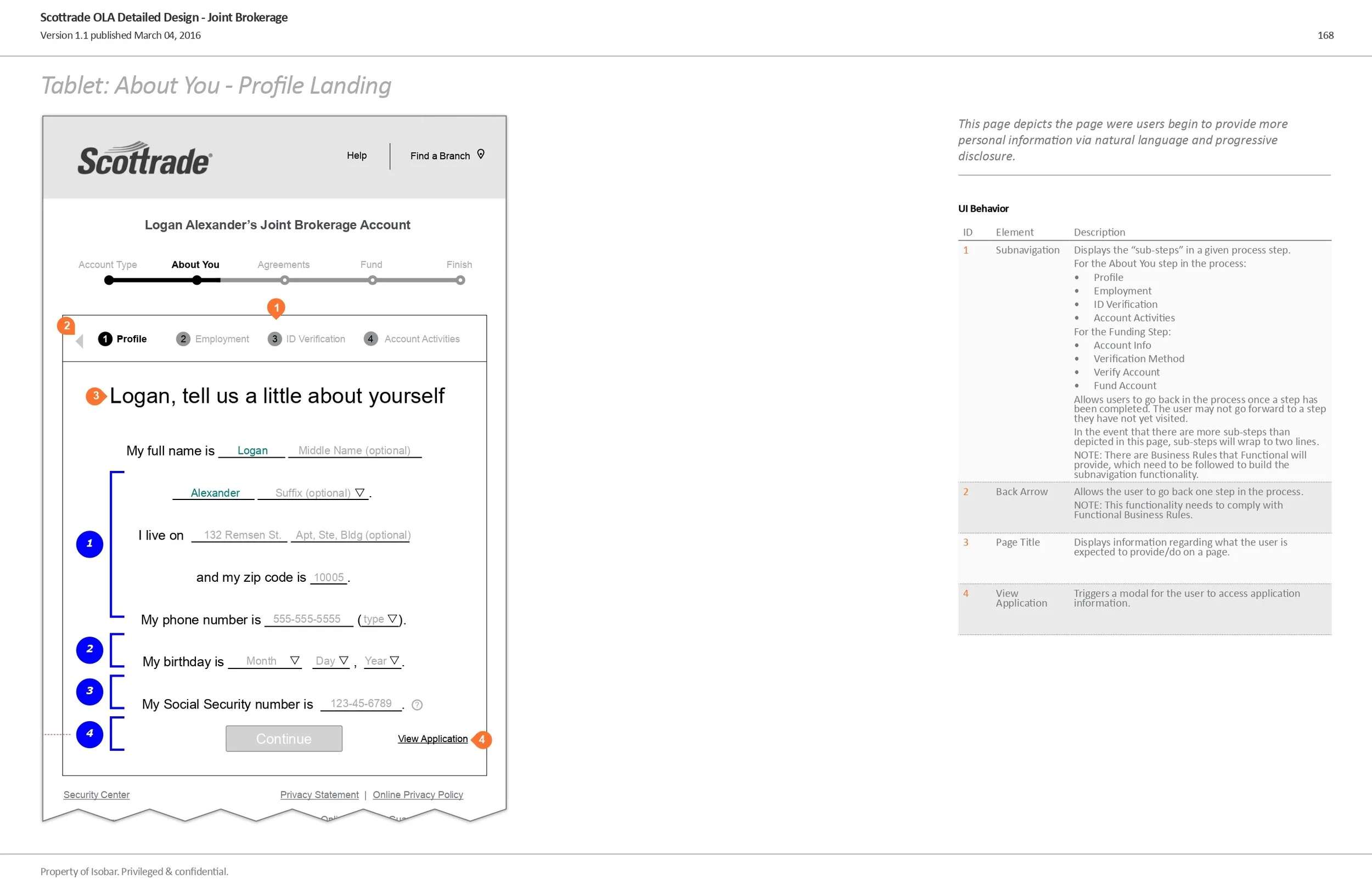
I showcased Progressive Disclosure in wireframes as seen below in blue brackets to the left. Each bracket contains the exact number of rows the system shall display to the user at a time.
Wireframe
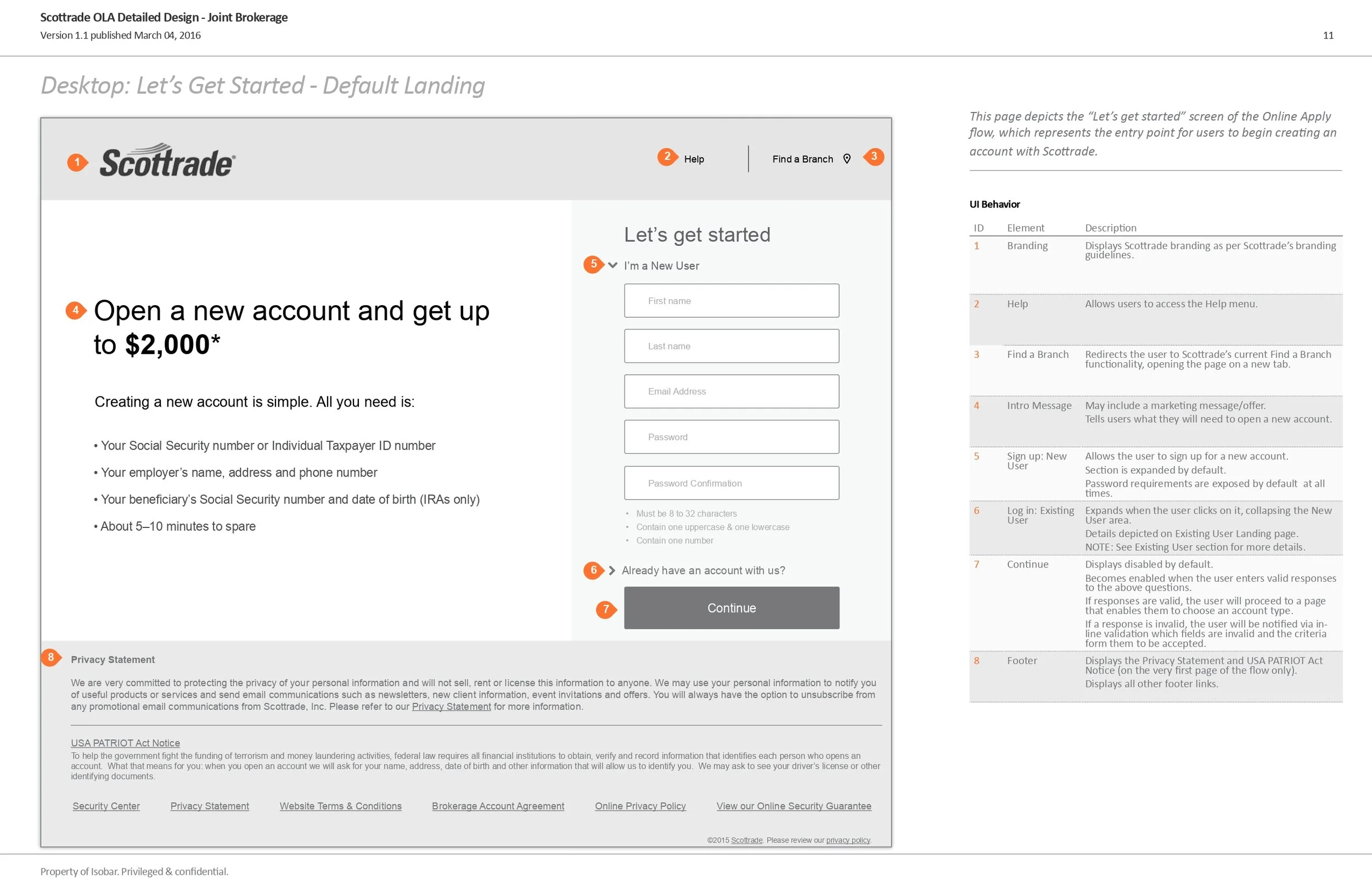
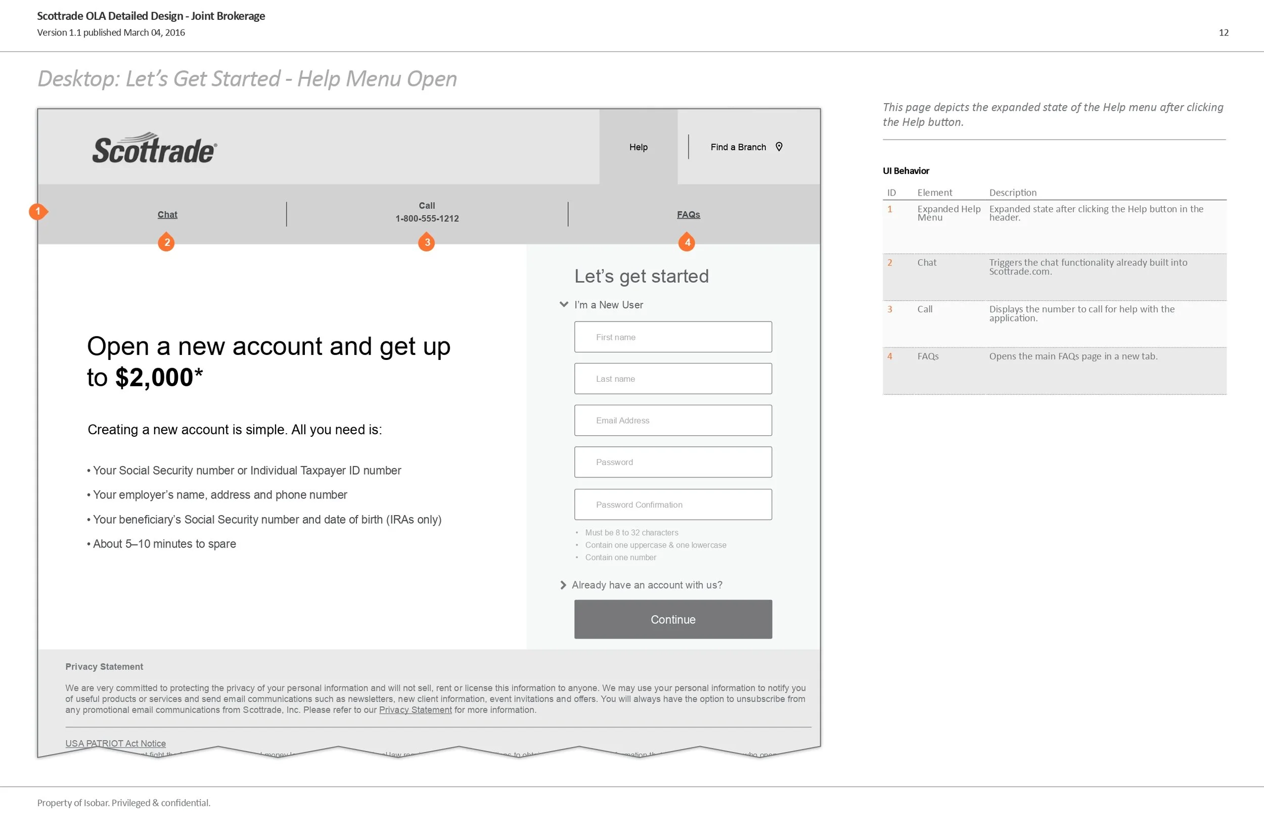
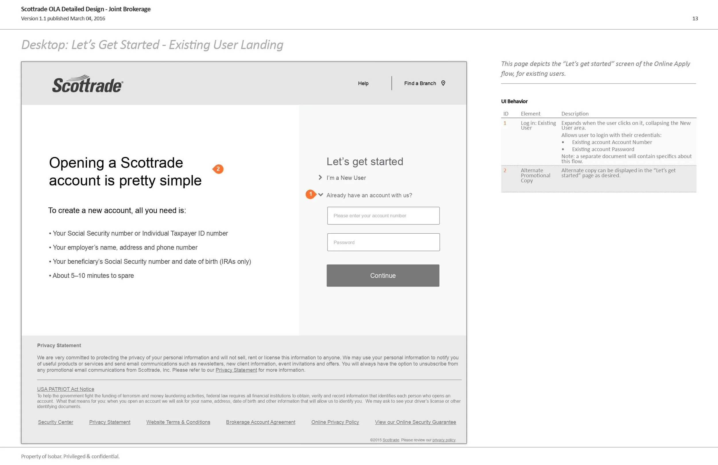
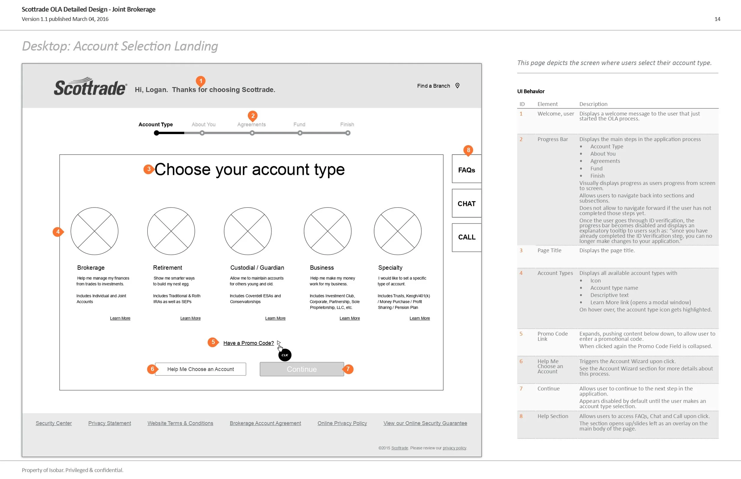
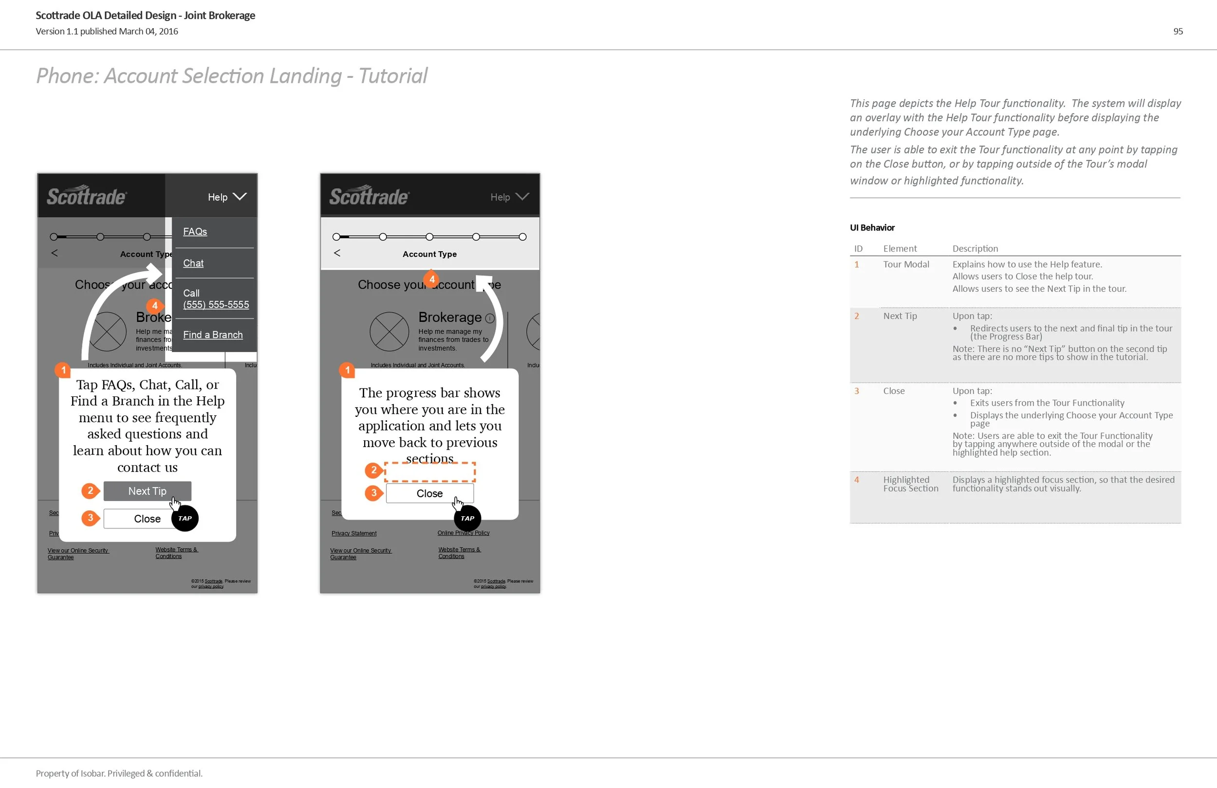
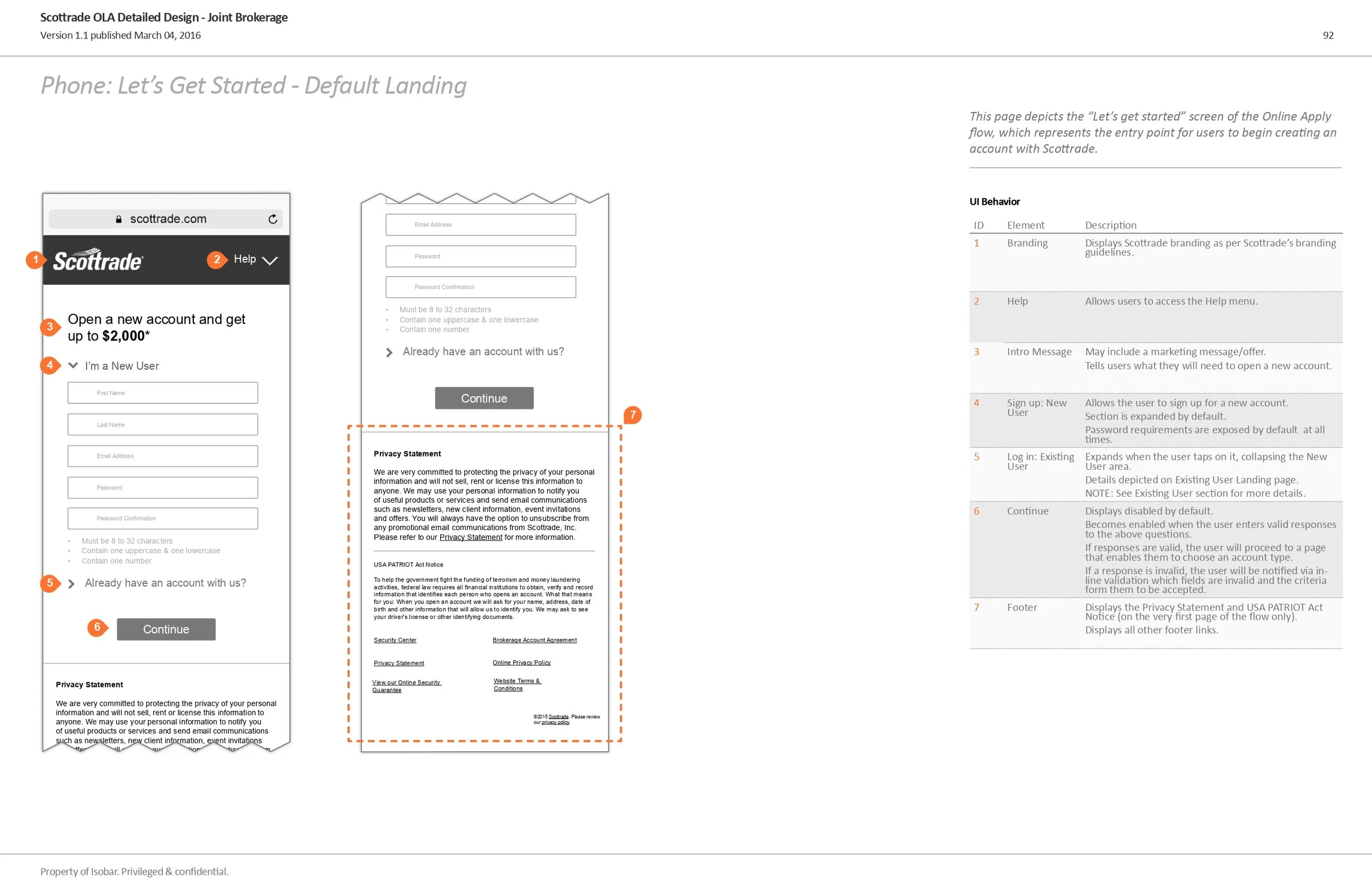
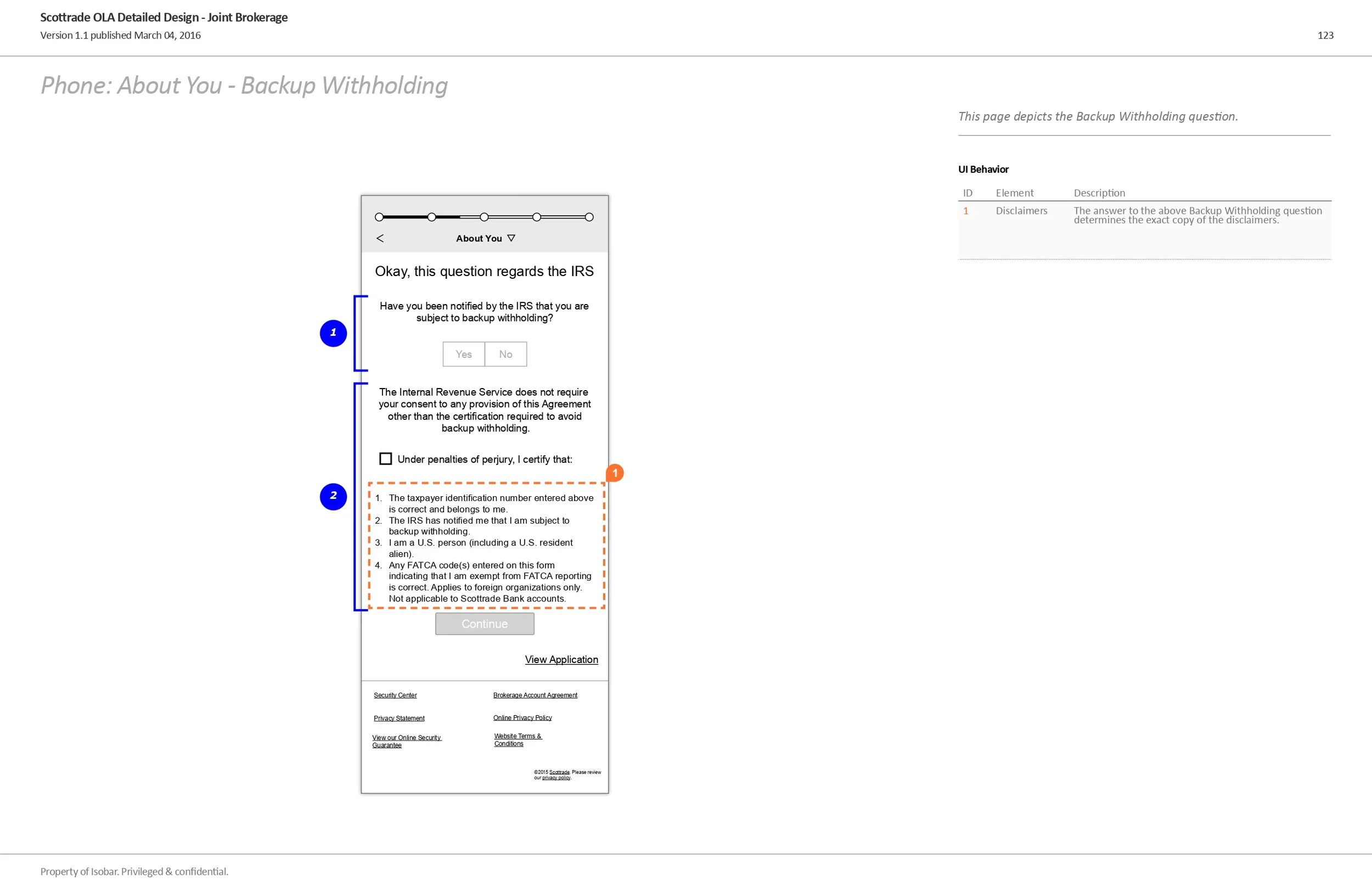
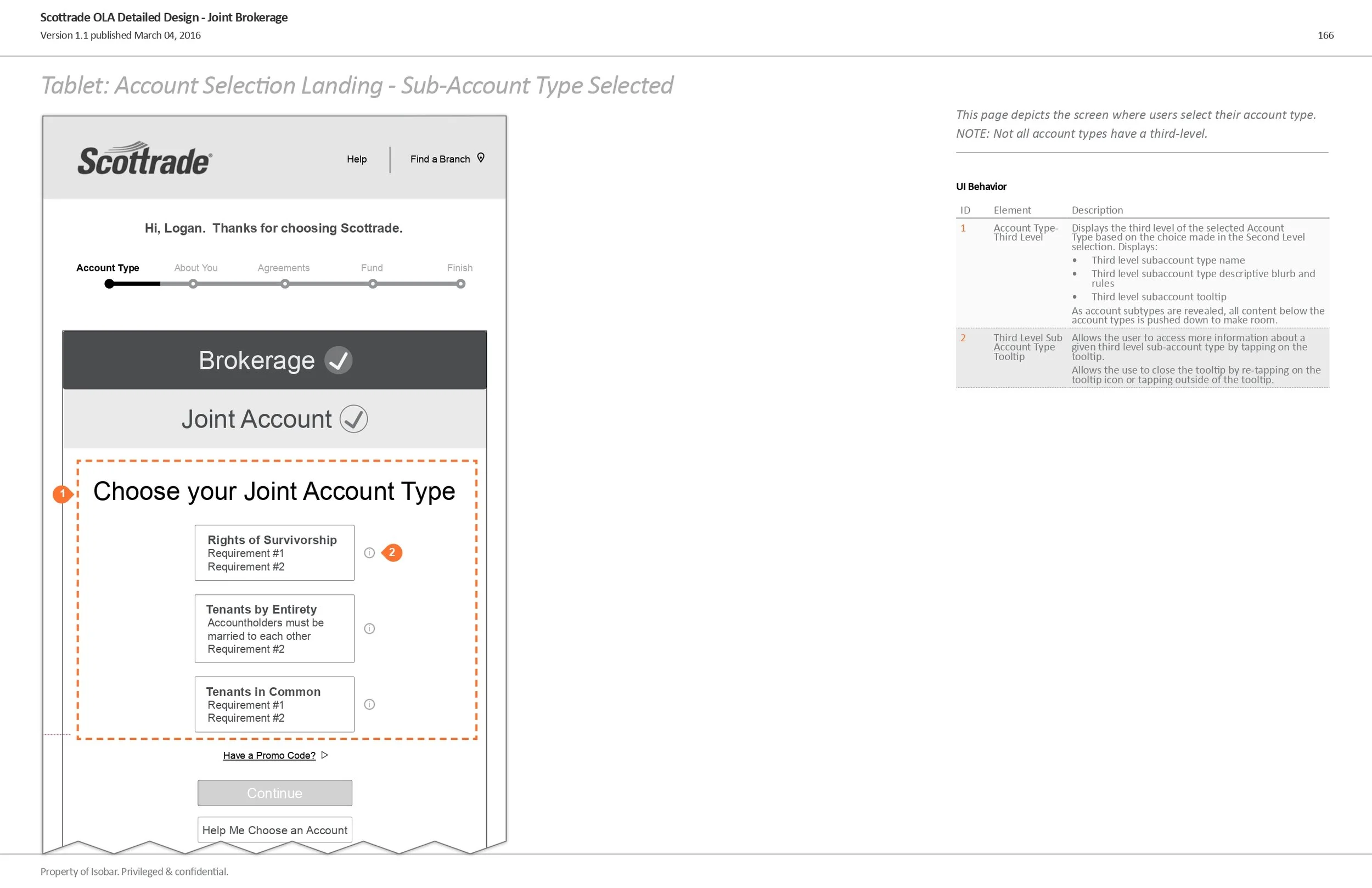
I designed for desktop, tablet, and mobile. Responsive.
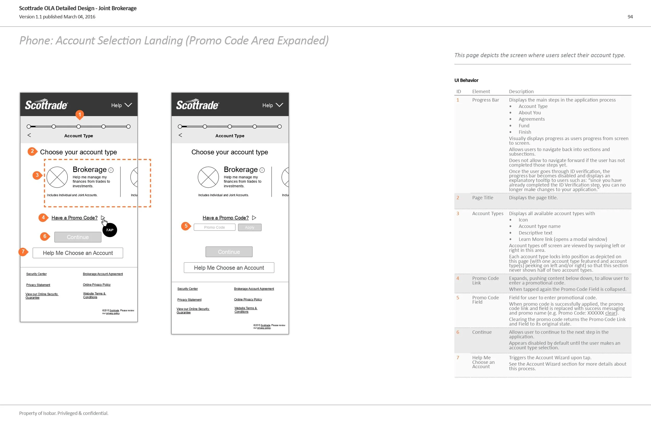
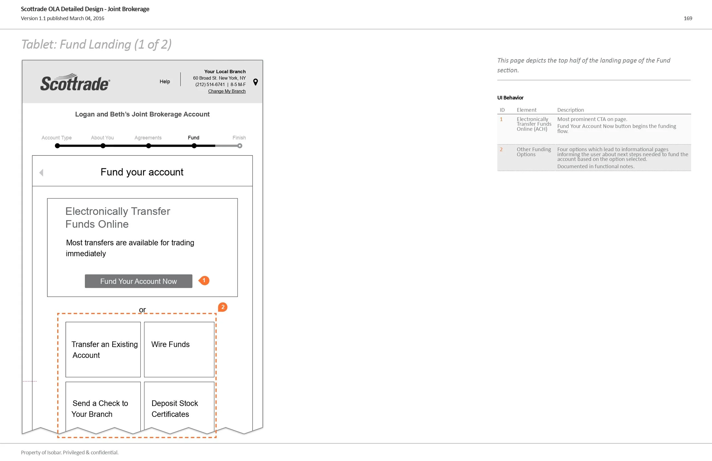
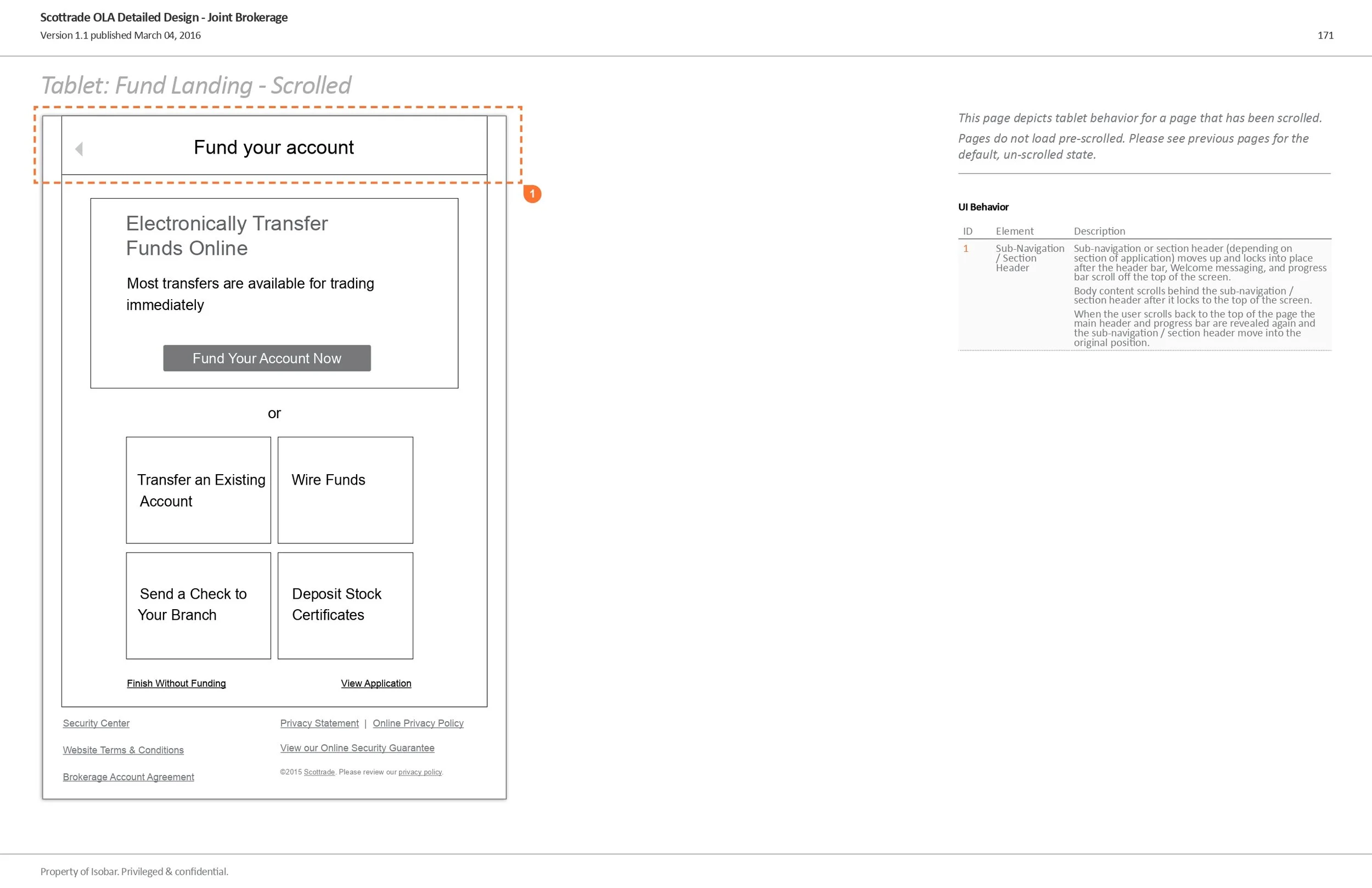
Below, you will see a sample of high fidelity and annotated wireframes I created for Desktop. We used Adobe InDesign for all wireframes.
Progressive Disclosure Wireframe
Below are sample high fidelity annotated wireframes for Mobile
Below are sample high fidelity annotated wireframes for Tablet
Creative Design
As I was designing the UX I also worked with the Creative Design team to answer their functionality and UX questions and to provide feedback on their graphic design.
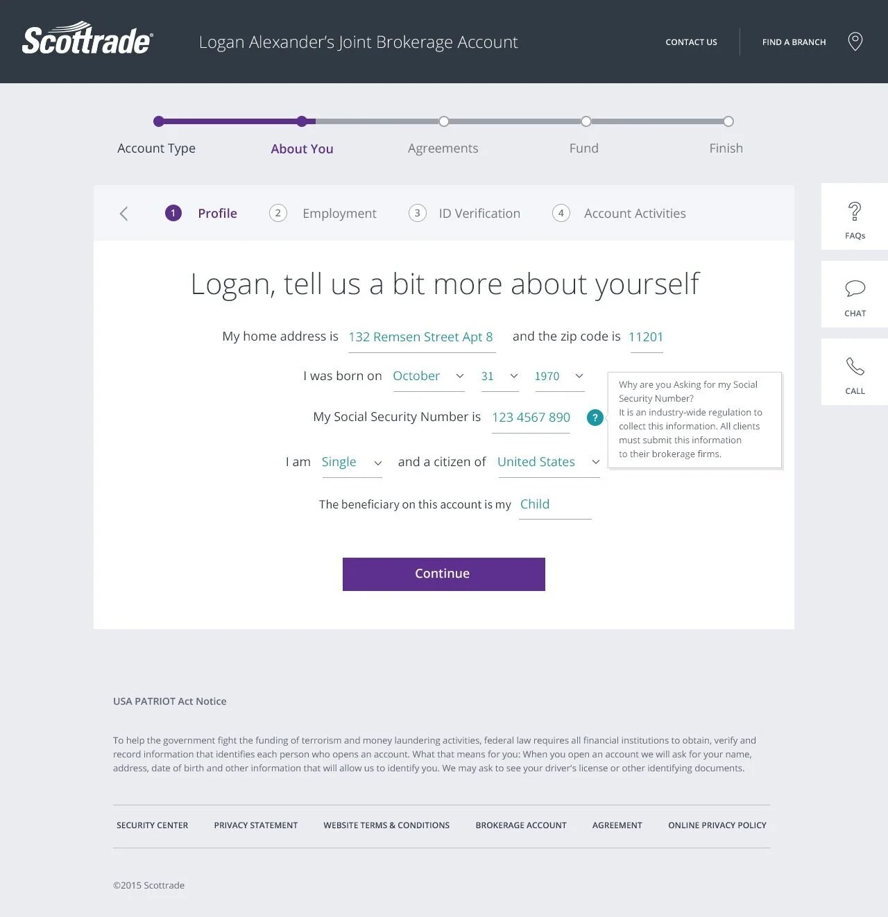
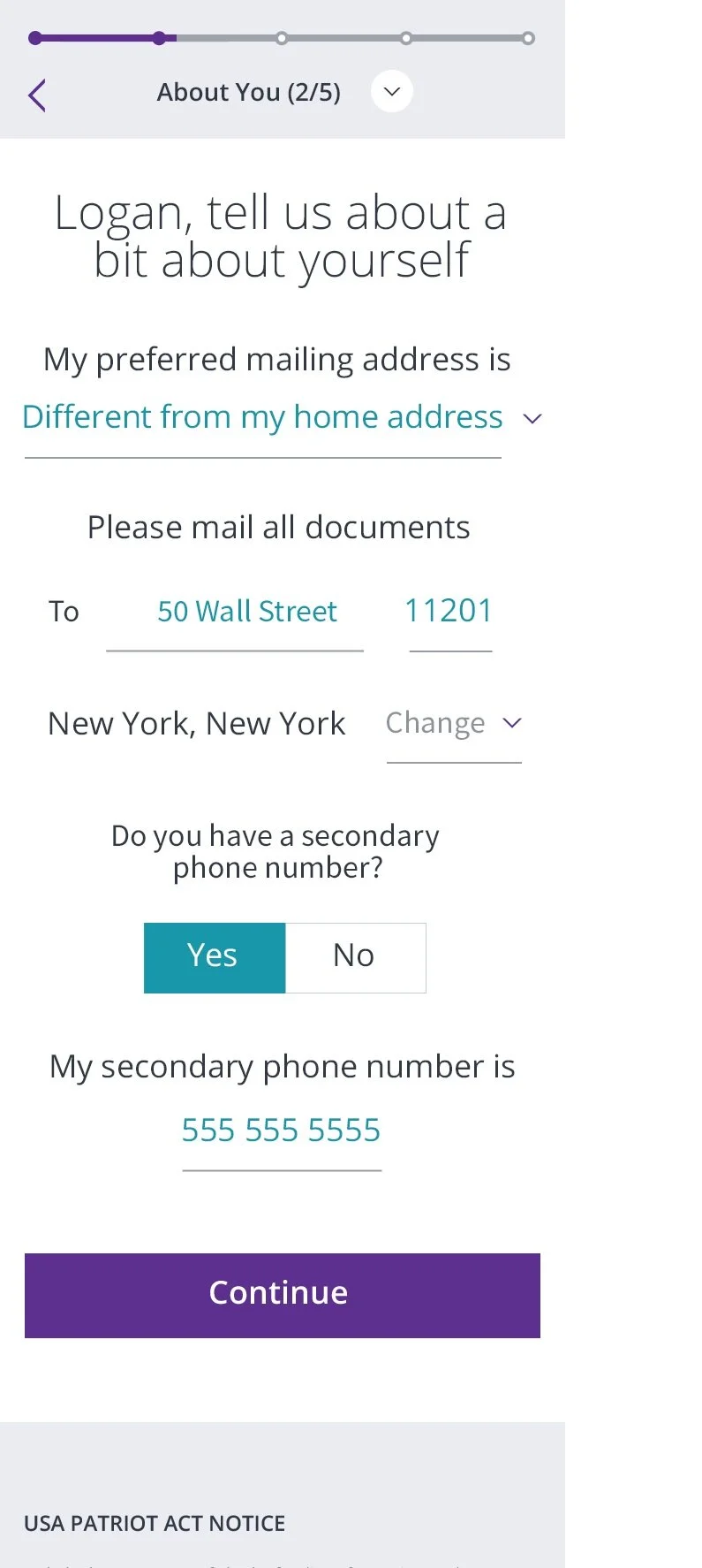
Below are some graphic design samples the Creative team created based on my wireframes (and those of my other two team members)
Design for Tablet
Design for Phone
Design for Desktop
Design for Desktop
Development, Testing & Launch
I served as the subject matter expert resource for the dev and testing teams when it came to questions regarding functionality.
I also conducted about five hours of functional testing for the product and reported bugs via Jira.
Our testing and dev teams did a great job, and the product launched on schedule. Scottrade was very happy with our performance. Their initial business target of 30% increase in new accounts opened online within the first three months was surpassed. Scottrade reported a 63% increase.
CONCLUSIONS
It pays to innovate. I recommend to always back up innovative ideas with data analysis and/or user research, and usability testing whenever possible.
I had the correct intuition to introduce progressive disclosure for this product given that users need to answer more than 150 questions before they open a trading account. Nevertheless, I did not leave it at intuition and instinct alone. We backed up my idea with the results of our UX study, UX research and usability testing. In doing so, we also obtained more committed buy in from our clients.
For projects of this magnitude it is always recommended to gather a team of talented individuals that can specialize and focus on specific tasks. For many years in my career I have worn the UX and Product hats, and it has been a formative and challenging experience. However, this is not recommended for any project of medium size and above.
No matter how well structured and efficient your workshop format is, always be open to being flexible about skipping a step. My Co-design Studio was nearly “perfect” when designed, but -looking back- I could have gotten the same results without the Group Sketch step.
