CITCO
This product is a multicurrency, multi time zone, B2B platform that supports the day-to-day work of Investors and Investment Managers at Citco.

OVERVIEW
Sector Financial- global hedge fund.
Project Description Meka helped design a multicurrency, multi time zone, B2B platform to support the day-to-day work of Investors and Investment Managers at Citco.
My Roles Senior UX Designer, Senior Product Designer.
Business Challenge Investors and Investment Mangers deal with vast amounts of data on a daily (if not hourly) basis. Citco wanted to created a portal where ends users could rapidly digest data and ultimately make the smartest decision possible.
Design challenge Design an impeccable product that displays vasts amounts of data in multiple currencies and accross different time zones.
Result Citco reported an overal increase of 43% in user satisfaction.
Viewpoints Desktop
PROCESS BREAKDOWN
Needs Gathering
The project had already started about a month before I joined the team. Therefore, my first task was to conduct needs sessions. I was assigned specific components to design for.
When I joined, needs workshops were being conducted via conversations with stakeholders and ends users. The information was relevant and of high quality. The team was wireframing based on written needs, instead of needs + story boards, which is my personal preference.
Learning I very much wanted to introduce my Co-design Studio technique to my team and client. However, I had just joined as a full-time employee and the project was already underway. So, I did not want to come accross as imposing and “over revolutionary” since the client was happy with the way things were getting done. At the time I semi-regretted not advocating for Co-design Studio. Looking back, I believe it was the best way to proceed given that the project was already efficiently underway and running in an efficient manner. I was also new to my agency and the project and it was best that I took some time to build my reputation before trailblazing with new ideas that could have interrupted the nice flow my colleagues had already set up for the project.
Next, I wireframed in InDesign. I was in charge of the Documents and Individual Investment Funds components.
Wireframes
Internal UX Sessions
I held a few internal sessions where all three UX designers (I was one of them) discussed how to best approach each component.
Once in agreement about the best way to proceed, we each designed our assigned components.
Design Principles
Before I started wireframing, I defined my own informal design principles, which I shared with my team.
SD Simplified Design
JRD Just-right Data Display
I did so based on the project’s design challenge: Design an impeccable product that displays vasts amounts of data in multiple currencies and accross different time zones.
Below, you will see high fidelity, annotated wiframes I created for the Investor Dashboard. The images represent the complete flow for the Investor Dashboard.


Investor Dashboard Overview
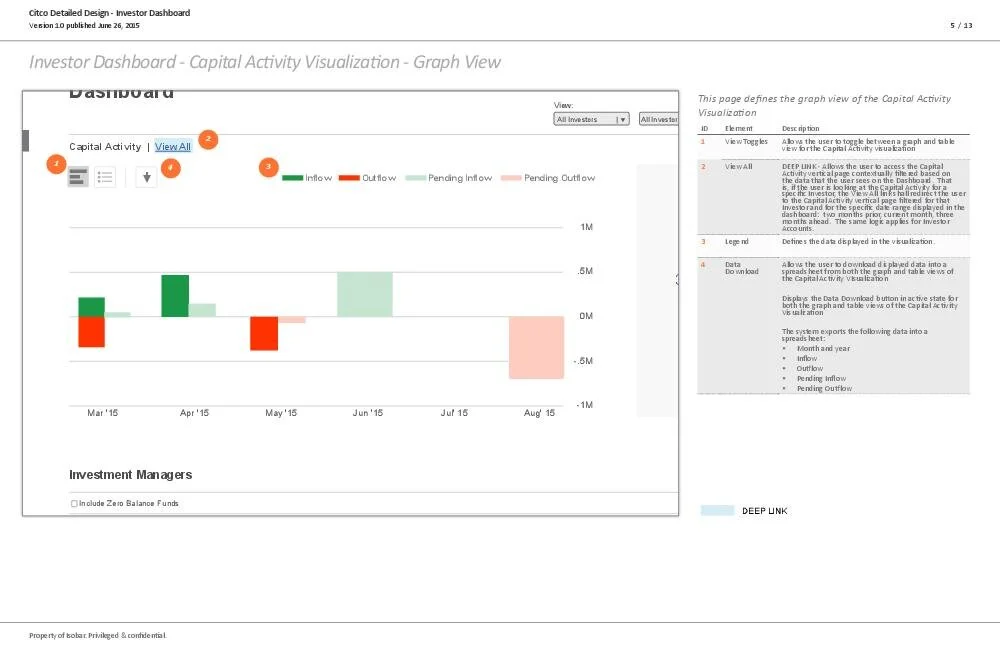
Capital Activity Visualization- Graph View

Capital Activity Visualization- Graph View

Capital Activity Visualization - Table View

Document Viewer
This wireframe also showcases how I call out functionality that needs to be finalized

Document Viewer- No Unread Documents to display

Investment Manger Cards

Investment Managers Search

Investment Managers List View

Exception for the Investment Managers Cards: No new documents to display.
Creative Design
As I was designing the UX I also worked with the Creative Design team to answer their functionality and UX questions and to provide feedback on their graphic design.
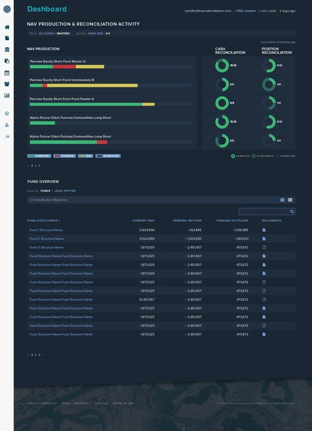
Since the amount and complexity of the data to display on screens was particularly challenging for this project, I made sure to work very closely with our amazing graphic designers to come up with the best data visualizations.
Below are some graphic design samples the Creative team created based on my wireframes (and those of my other two team members)

Dashboard

Investors Cards List View
Investors Cards List View
CONCLUSIONS
When challenged with projects that involve vasts amounts of data, prioritizing the data that needs to be displayed first and simplifying the design are design principles I recommend.
When you join a project that is already underway, it pays to step back and observe how things are being done. If the project is running smoothly and the client is happy, there is no immediate need to introduce new ways of runing meetings. Even if you know for a fact that gamestorming and design thinking workshops are fun and efficient.